
Quick OverviewLiving room colour schemes refer to the selection and combination of hues used to define the style, mood, and personality of the space. They influence how walls, furniture, and accessories look together and set the overall tone of the room. Colour also affects how spacious, bright, or cosy a room feels, making it a key part of interior design.This blog will walk through:✅ Different colour moods: warm, calm, bold, and timeless neutrals✅ How colours impact space, light, and atmosphere✅ Layering and combining colours for balance and harmony✅ Practical tips like the 60-30-10 rule and testing samples✅ Using accents to add personality without repainting✅ Tried-and-true colour combinations for inspiration
Your living room is more than just a place to sit—it’s the heart of your home. It’s where you relax after a long day, entertain friends and family, or curl up for a movie night. But creating a space that feels warm, welcoming, and uniquely yours often starts with one key decision: colour.
Choosing the right colour palette for your living room can completely transform the mood and style of the space. Whether you’re going for calm and cosy, bold and modern, or elegant and timeless, the colours you use will set the tone.
In this blog, we’ll explore a variety of living room colour ideas to inspire your next redesign and help you create an inviting space you’ll love spending time in.
Why Colour Matters in the Living Room
Colour has a psychological impact on how a room feels. Some shades energise a space, while others calm it down. When chosen thoughtfully, your colour scheme can:
- Make a small room feel larger
- Create a sense of warmth or coolness
- Reflect natural light more effectively
- Influence your mood and comfort level
- Tie together furniture, flooring, and décor
That’s why picking the right palette is a balance of style, function, and personality.
Warm and Cosy Tones
If you want your living room to feel like a comforting retreat, warm colours are a great choice.
🔥 Terracotta and Earthy Browns
Terracotta brings a sense of grounded elegance to a space. It pairs beautifully with warm woods, leather furniture, and soft textiles. Add woven rugs, clay pots, and warm lighting to complete the look.
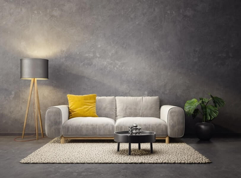
🍂 Mustard Yellow
Mustard tones offer a rich, golden warmth without being overpowering. They work well in both contemporary and retro-style living rooms and combine beautifully with greys, charcoals, and deep greens.
🌾 Taupe and Warm Neutrals
If you’re looking for something more subtle, taupe, greige (grey + beige), and warm off-whites add softness while still offering a welcoming vibe. These neutrals also allow more flexibility in your furniture and decor choices.
Calm and Serene Palettes
Prefer a more peaceful, uncluttered space? These colours evoke calm and clarity.
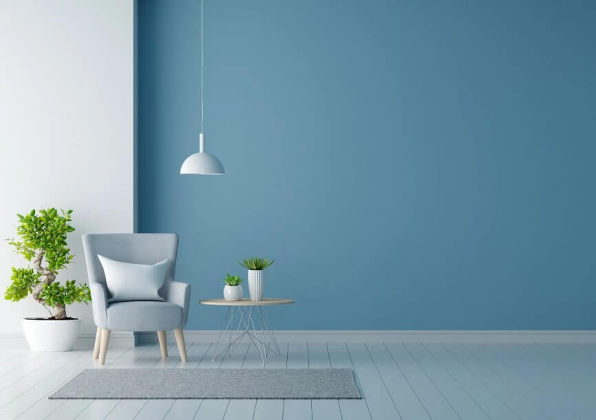
🌊 Soft Blues
Pale blue or dusty teal can make a room feel airy and tranquil, especially when paired with white or sandy beige. Think beach house vibes—even in the city.
🕊 Sage Green
This gentle green is a top choice in modern interiors. It feels natural and fresh, reflecting the outdoors and working well with wooden furniture and textured fabrics like linen and wool.
❄ Cool Greys and Whites
Greys have been a staple in interior design for years. A cooler grey with blue or silver undertones adds sophistication, while a creamy white keeps things clean and modern. Add texture through cushions, throws, and layered rugs to keep it from feeling too stark.
Bold and Dramatic Colours
If you’re not afraid to make a statement, bold colours can give your living room depth and personality.
🎭 Deep Navy
Navy creates an enveloping effect, ideal for large living rooms or those with high ceilings. It pairs well with metallics like brass and gold, as well as blush pink or burnt orange for contrast.
🍷 Burgundy or Plum
These rich, luxurious shades add drama and opulence. Use them on an accent wall or in a monochromatic palette for maximum impact. They work well in moody, vintage, or eclectic spaces.
🖤 Charcoal or Black Accents
Black walls might sound intimidating, but when done right, they ooze elegance and intimacy. If painting all four walls black feels too heavy, try it behind a gallery wall or fireplace to ground the space.
Timeless Neutrals That Always Work
If you prefer a classic look that stands the test of time, these neutral tones are for you.
☁️ Classic White
You can’t go wrong with a crisp white living room. It reflects light, makes the space feel open, and serves as a blank canvas for your furniture, artwork, and plants.
🌾 Beige and Cream
These shades add softness and warmth without stealing attention. They work especially well in traditional and Scandinavian interiors.
🪨 Stone and Soft Greys
Neutral greys, especially those with warm undertones, add sophistication and are perfect if you want to avoid the “too cold” look of stark white.
Creating a Colour Scheme That Works
When choosing colours for your living room, keep these tips in mind:
1. Think in Layers
Start with a base wall colour, then layer in secondary and accent tones through furniture, rugs, cushions, and decor. A neutral base with bold accents gives you flexibility.
2. Use the 60-30-10 Rule
This classic design rule suggests:
- 60% of the room is your main colour (walls or large furniture),
- 30% is your secondary colour (curtains, smaller furniture),
- 10% is your accent colour (artwork, cushions, throws).
3. Consider Natural Light
Rooms with lots of natural light can handle darker or cooler colours. Dimmer rooms might benefit from warmer, lighter tones to avoid feeling gloomy.
4. Test Before You Commit
Paint samples on your wall and observe them at different times of the day. Colours can change dramatically under natural vs artificial light.
Adding Personality with Colour Accents
Even if you choose a neutral base, you can inject character through:
- Bold-coloured sofas or armchairs
- Bright artwork or prints
- Vibrant throw cushions or blankets
- Patterned rugs or curtains
- Coloured shelving or built-in storage
These accents are easier (and cheaper) to change than repainting the walls—perfect if your taste evolves over time.
Colour Combinations to Try
Here are a few tried-and-true colour pairings that look stunning in living rooms:
- Sage Green + Cream + Tan Leather
- Charcoal Grey + Blush Pink + Gold Accents
- Terracotta + Navy Blue + Off-White
- Soft Blue + White + Natural Wood
- Warm Beige + Forest Green + Black Metal
These combinations are balanced, stylish, and easy to personalise with your favourite textures and finishes.
Final Thoughts
Choosing the right colours for your living room isn’t just about trends—it’s about creating a space that makes you feel good every day. Whether you want it to feel cosy, peaceful, energised, or elegant, your colour palette is the foundation.
Take your time. Collect inspiration. Test samples. And most importantly, make it yours.
A well-designed living room doesn’t have to cost a fortune—it just needs to reflect the way you live and what makes you feel at home.
← Previous
Simple but Crazy Children’s Craft Ideas: Enhance Your Child's Creativity
Next →
How to Decorate Your Living Room with Pictures: Unique Home Décor Ideas!

About the Author
HTTHQ0rwX6rU4Qk
Professional educator and content writer at StudyMate Central, helping UK professionals advance their careers.